My Design Reasoning Behind this Portfolio
The Main Idea
I wanted this portfolio to not waste any time.
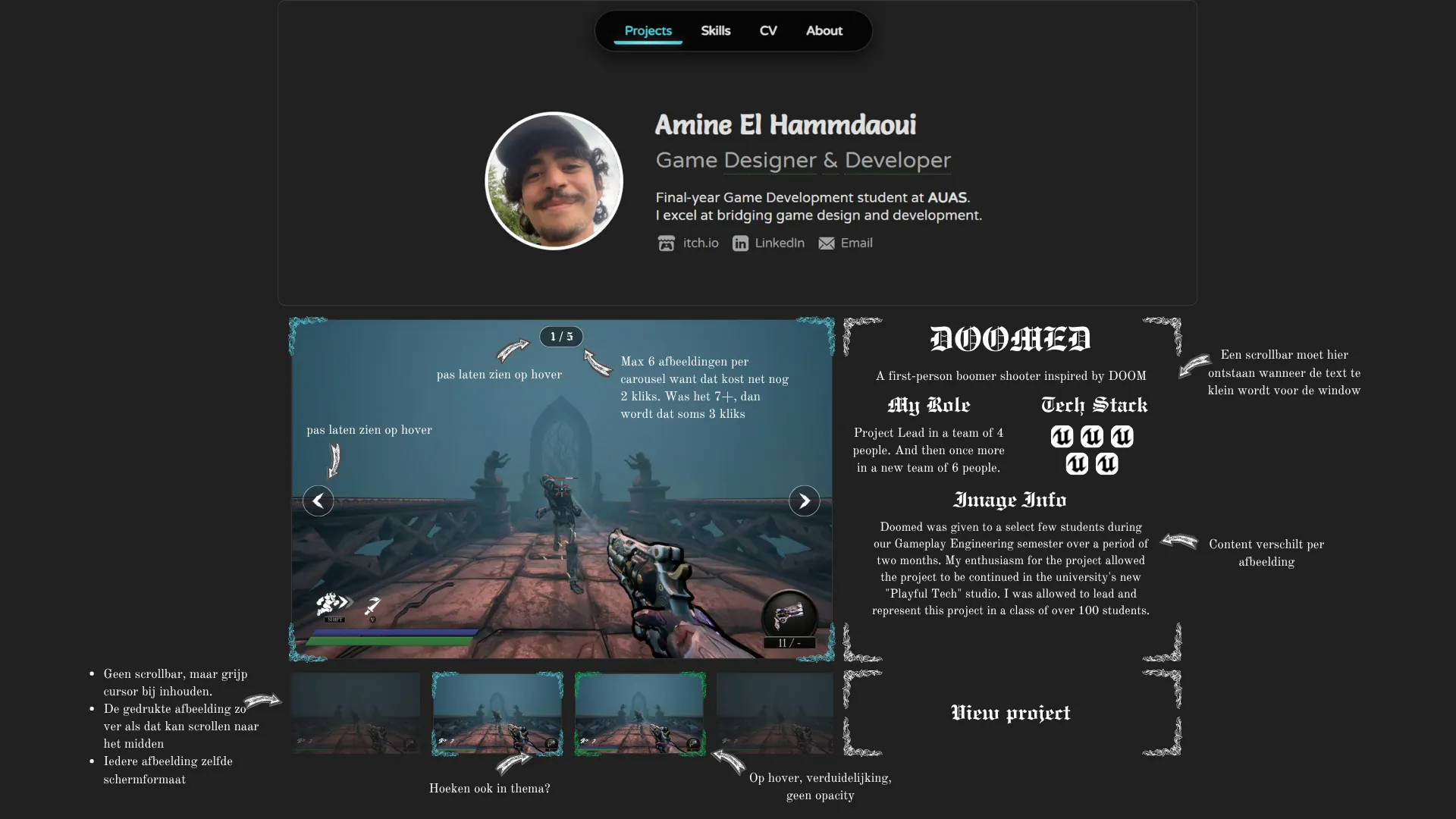
- I made my portfolio's homepage the projects page.
- This page has a profile banner, with only necessary information.
- P
- Projects can be inspected using the carousel. If the viewer is done reading the current project, they can go past it with half a scroll. Much like horizontal & vertical progression in RPGs.
- Where text was necessary, I tried to make it specific to my work rather than filling it with generic portfolio language.
- I kept the background visually repetitive so it wouldn't compete for attention with the main work.
Show dont tell. I dont bother saying I'm passionate, I will show you I'm passionate. I won't bother telling you I have attention to detail, I'll show it instead.
However, this "show, don't tell" approach isn't a rule you can forever rely on when selling your game design skills, as that is something which needs to be explained well.
I kept most of my detailed design thinking exactly 2 clicks deep, while keeping generic information 1 click deep.
Projects Page
I wanted my projects page to communicate that my game design and game development skills are connected and influence each other, rather than separating them completely.
-
Doomed
I started with a project that showcases my best skills simultaneously: design thinking, player experience, game systems and implementation.
-
Tetris AirConsole
I placed Tetris second because it is a shipped project and shows both player experience work, and implementation work across UX, feedback and animations.
-
Engamine
I placed the engine last because I wanted my technical work to be visible without letting it dominate the portfolio. One strong technical project gives me a place to demonstrate lower-level programming and system architecture, while the rest of the portfolio can show how I apply design thinking across very different projects.
-
Other Projects
I also wanted a way to include my other projects without giving them the same importance as my three main projects. This made me create an interactive project gallery, where my visitors can explore additional work themselves in a fun way.
I originally called it "The Underground" because I treated it like a small game. However, people entering the gallery often did not understand what they were looking at or why they were there. I changed the header to "Other Projects" with the call to action being "Dig deeper" to communicate the function of the experience while remaining ominous.
My carousel layout gives the viewer control over what they're interested in and at which pace they want to know more. This creates "active engagement" as opposed to passive if the carousel were to rotate by itself
Skills Page
I faced a lot of problems when designing the skills page's layout.
My first iteration included a couple blocks in a grid, where each block represent one specific skill.
However, I realized that this isn't a great way of showing one's skills, because skills influence each other. A game mechanic might exist to reach a player experience goal, or a change to the pacing might be necessary to make that mechanic understandable.
This is why I ended up with a "Skills Showcase": a collection of articles where each article is linked to one or more filterable skills.
My article titles used to be very boring, descriptive titles. This was before I realized that readers wanted to read about my "impact" instead. I tried achieving this by writing more interesting titles by thinking what I actually achieved with my work:
- From "Designing Gamified Physiotherapy Exercises in VR" to "Making Physiotherapy Exercises Fun"
- From "Creating Multiplayer Stability in a Tetris Game" to "Reducing Confusion & Frustration in Tetris AirConsole"
- From "Environmental Hazards" to "Forcing Interesting Repositioning"
- From "Improving DOOMED's Onboarding" to "Making DOOMED Easier to Learn"
- From "Designing a Play of the Game for a Karaoke Game" to "Finding the Most Fun 15 Seconds of a Karaoke Performance"
I realized that I could shape the entire thought process people have when reading my articles by simply changing the title, despite the content remaining the same.
About Page
I believe personality to have a strong place in the gaming industry.
The main intro shows a banner with a moment I'm proud of, where I'm presenting in front of ~80 other students while being a student myself.
The section after has testimonials to show how I work with other people rather than only showing what I can do.
Everything after that is deliberately more personal and playful, as I hope that would increase the memorability of my portfolio.
Why I Made This Article
I consider this portfolio another showcase of my design skills, as it answers and solves some design problems:
- What should the user see first?
- What information is actually necessary?
- How do I guide attention to this information?
- How do I show my impact when the viewer only has a few seconds?